the goal
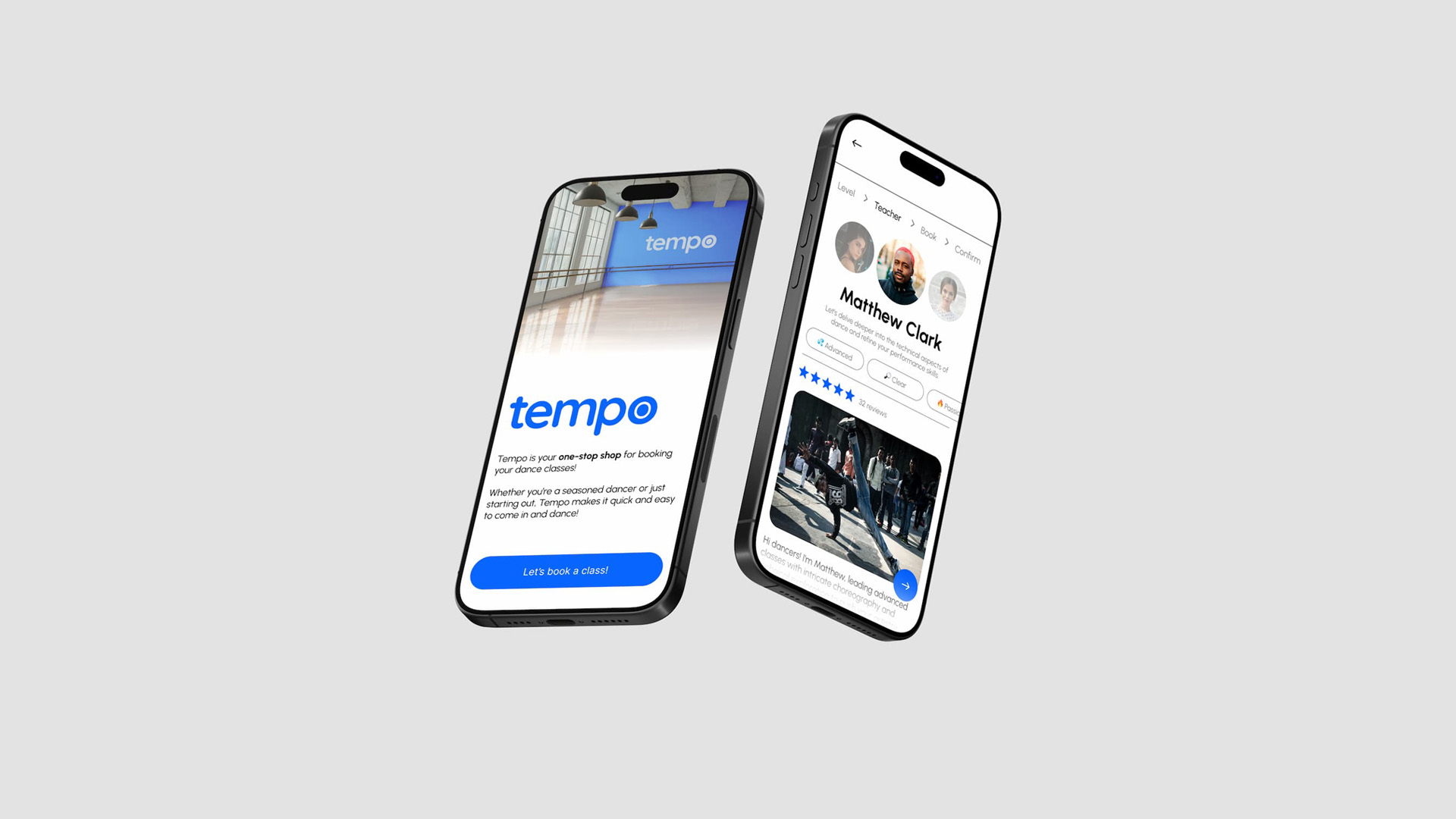
construct a high-fidelity prototype for a mobile app in Figma for a dance studio. this project involves conducting user research using common strategies, performing an unmonitored usability test, and writing a report with recommendations, and implementing possible solutions based on the findings.
user research
the first phase of this project focused on defining the app’s concept, conducting user research, and creating low-fidelity wireframes for the app. for this project, i created an app where users can book classes for a fictional dance studio called Tempo.
as a dancer who frequently uses mobile apps to book workshops, i'm familiar with what works and what could be improved upon in the booking process.
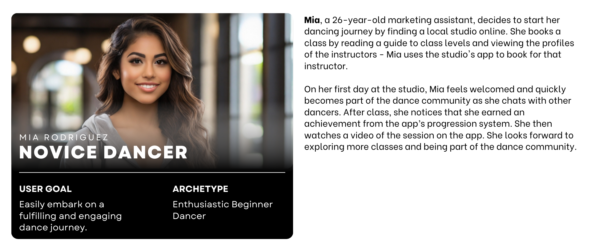
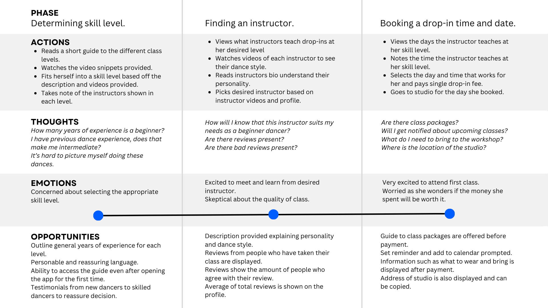
after settling on a topic, i identified the target audience using multiple research strategies such as: a user persona, a user scenario, an empathy map, and a journey map. by creating these documents, i was able to confidently define what beginner dancers desire from the app.


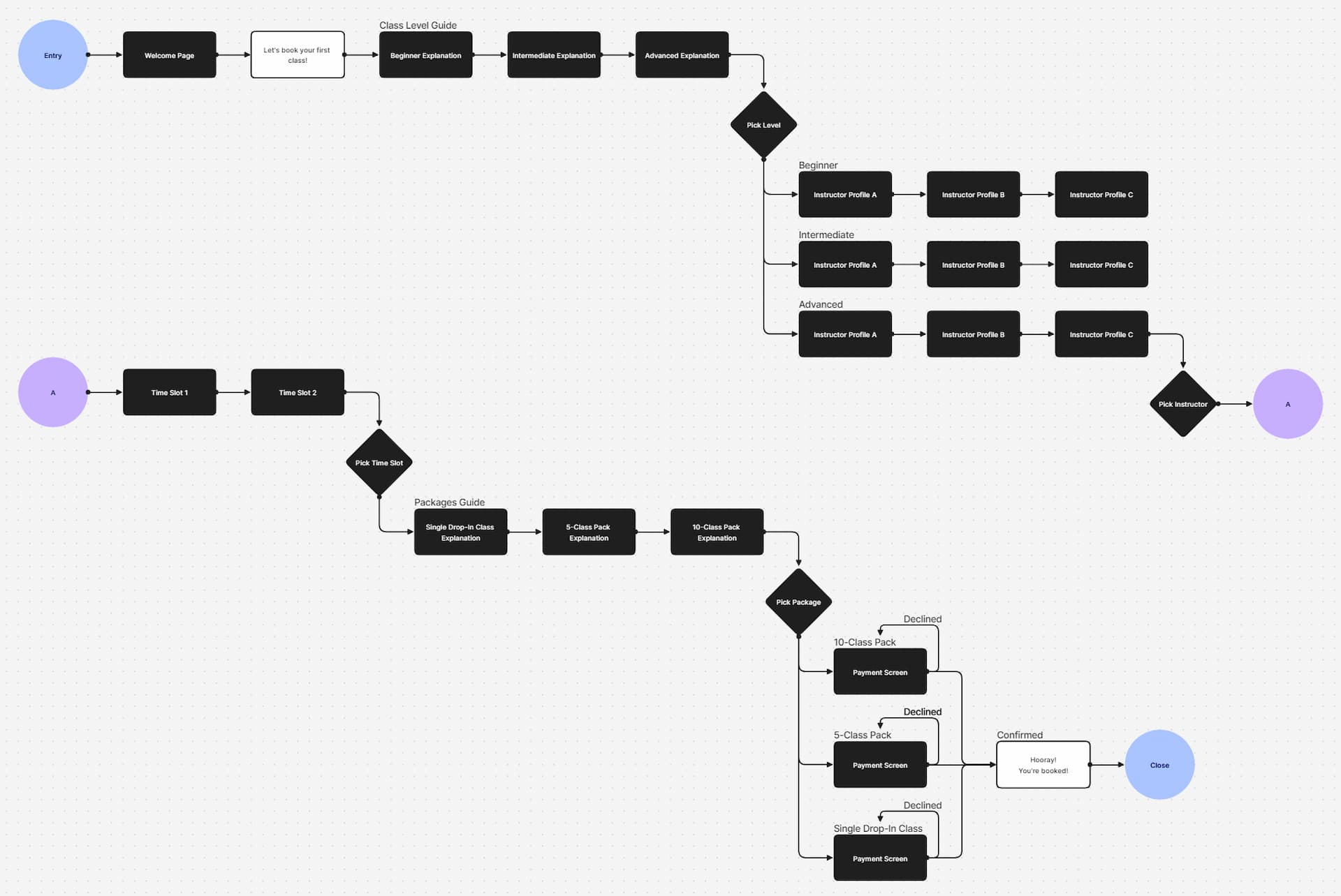
following the research, i created a flowchart to outline the process which the target user follows in this app. for this prototype, i focused specifically on the process of booking a first dance class, as my research indicated that this can be a confusing and nerve-wracking experience for many beginners.
based on the flow chart, i designed low-fidelity wireframes in order to define the placements for text, images, and buttons. generally, booking an appointment or workshop is a linear process, so the screens i needed for the user flow were evident as soon as i created the flow chart.
prototyping and user testing
in the second phase of this project, i focused on adding functionality to the interface and testing prototypes with a user group. a challenge i faced was the larger-than-anticipated project scope, which involved many variables and conditional statements. however, my experience with JavaScript and the Figma community helped me quickly grasp the logic and create a functional prototype.
once the high-fidelity prototype was completed, i conducted user testing with six peers using Maze; these testers have never taken a dance workshop before, fitting the target audience of beginner dancers. the test included three tasks: selecting a skill level, choosing a teacher, and picking a workshop date. the test results provided valuable insights through heatmaps, misclick rates, and task completion times, which allowed me to refine the prototype and enhance the user experience.
revision and report
in the final phase of this project, i focused on writing a report on the Maze test results, detailing what went right, and what went wrong in the user testing. this step helps guide the app's development direction and identify what improvements could be made to improve results in future iterations should i choose to continue refining it.
one issue identified during testing was that most testers couldn't recognize the teacher labeled "passionate." Maze reported a 7.9% misclick rate, with many testers returning to previous pages or selecting the wrong teacher. only two testers chose the correct teacher, matthew clark, highlighting the need for clearer information presentation.
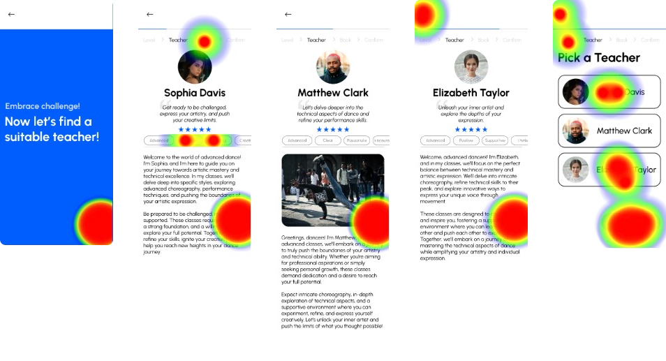

to address this, i reformatted the profile page, establishing a clear hierarchy for key information. i reduced the amount of text and added imagery, making it easier for users to quickly find and retain information. this revision was based on test results and aimed to make the app beginner-friendly for dancers.
